

Ten200
BRAND IDENTITY AND CAMPAIGN FOR a collaborative workspace in cupertino, california.
-
Ten200 came to us with their vision of creating the perfect place to be together, again — a workspace that balances the comforts of working from home with the amenities of an office. Situated in the heart of Cupertino, the rare property combines four stories of indoor office space with over 1 acre of beautifully landscaped mixed-use outdoor space.
We were challenged with creating an identity system that could communicate all of the property's unique offerings, while maintaining enough simplicity to allow potential tenants to envision their own brand inhabiting the space.
-
Client: Rubicon Point Partners
Studio: OMFGCO
Role: Lead Designer
Creative Director: Jordan Metcalf
OMFGCO Team: Fritz Mesenbrink, Lauren Masterson, Ed Martin, Brandon Gunderson, Elyse Yerman, Billy Rueck, Garth Klippert, Dylan Tibbetts, Katherine Garber
-
Naming, Brand Strategy, Visual Identity, Signage & Wayfinding, Copywriting, Campaign Concept, Photography Art Direction
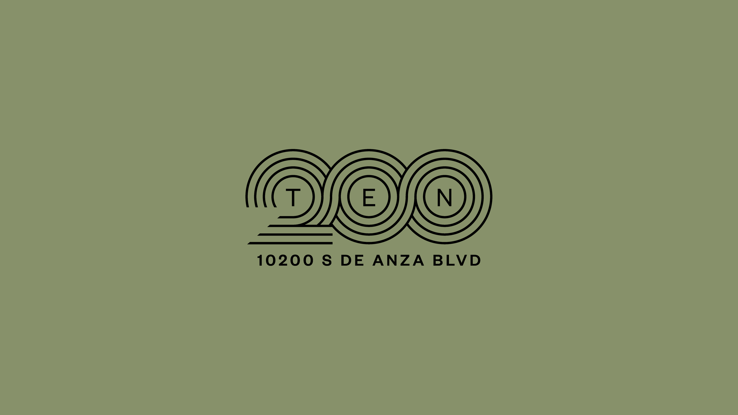
Informed by the architecture of the building, we created a fluid, yet monolithic mark using circular and rectilinear geometry and 4 lines as a nod to the 4 stories of the building. The logo speaks to the complex, connected and flexible space it represents.

The brand folds out into layers of contrast and harmony. Flexible grids, ambient imagery, and utilitarian typography combine to tell the story of the property and position Ten200 as an epicenter for collaboration, creativity, and community.

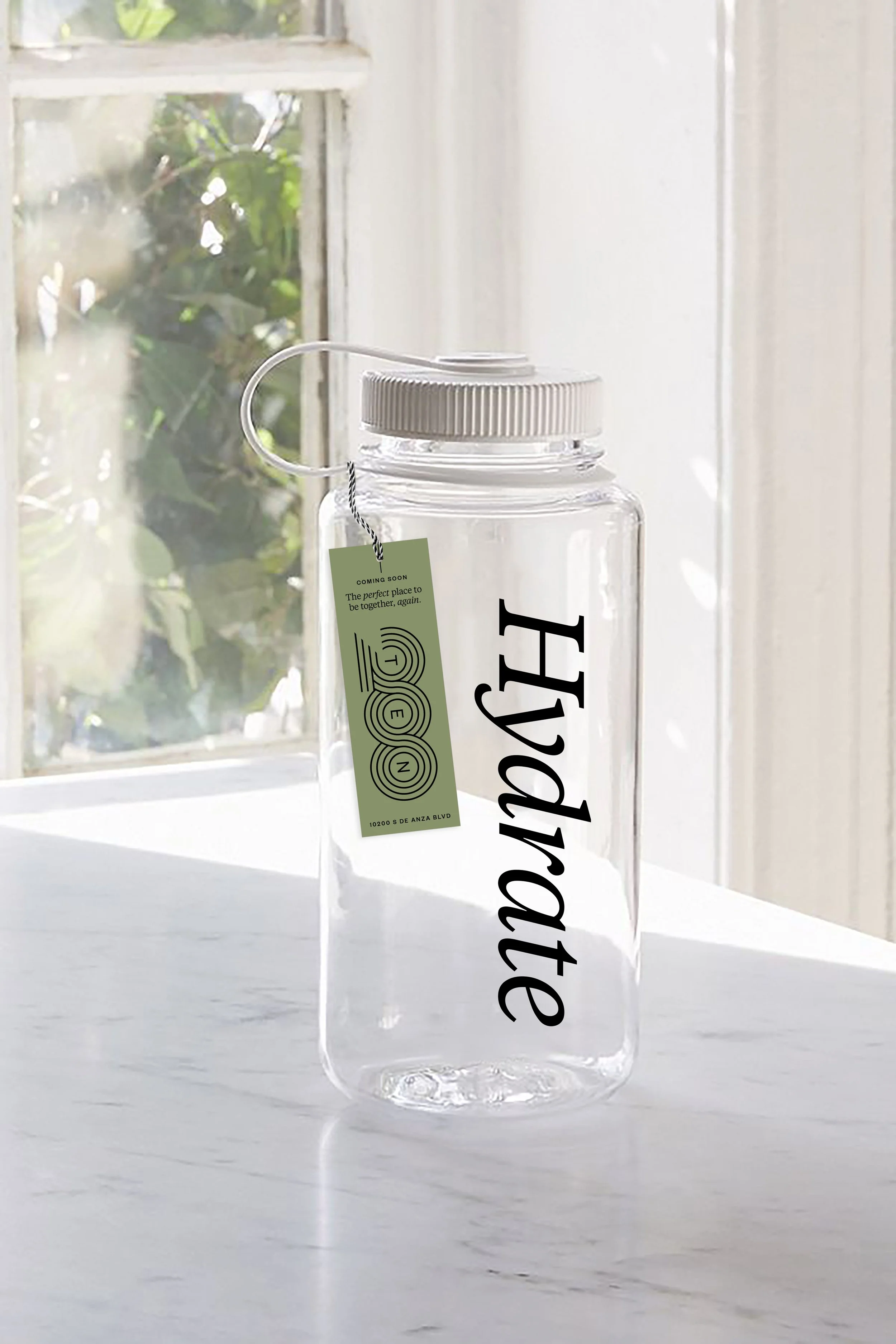

To pique the interest of potential tenants, we designed a postcard mailer on seeded paper and partnered with Modern Sprout to create a promotional gift that would highlight the key features of the property. A typographic reusable water bottle could be a lovely welcome gift for new tenants.
The second life of these gifts—a lavender desk plant, wildflowers to plant at home, and a water bottle to use at your workspace—gives recipients a taste of the lush plantings on the property.

