NEUTRAL
Visual identity, packaging, and marketing for a carbon-neutral food company aiming to lead the next global food revolution.
-
Our client, Matt Plitch, came to us with the goal to build a brand that sets the precedent for a sustainable, carbon-neutral food ecosystem.
Studies suggest that agriculture contributes to nearly 25% of global greenhouse gas emissions. In an effort to radically disrupt agriculture’s impact on our climate, Neutral chose to launch the brand with the humble glass of milk — a staple in the American diet for families and food service industries alike.
We developed a brand that was equally as ambitious as the business itself, finding the balance between being educational, aspirational, and most of all, fun.
-
Client: Matt Plitch
Studio: OMFGCO
Role: Designer & Illustrator
Creative Director: Jordan Metcalf
OMFGCO Team: Orion Janeczek, Fritz Mesenbrink, Andrew Ward, Ed Martin
-
Visual Identity, Illustration, Packaging, Signage, Photography, Copywriting, Marketing Campaign, Collateral
We decided to emphasize simplicity, friendliness, and transparency of Neutral’s message at the core of the design, beginning with the typography. We set the wordmark in all lowercase to bring a feeling of humanism and approachability. Letterforms were also customized to optimize flow and balance between linear and circular geometry.
Our inspiration for the logo came from their central brand goal of reducing their own carbon footprint to 0%. Coincidently, when turned 90 degrees, the percentage sign inherently takes the form of an ‘N.’ We leaned into this, creating a mark that is both a mnemonic for the brand, as well as a reminder of their goal.
We knew from the outset that we needed a compelling color story to convey the purpose of the brand and help it stand out from the wall of white in the dairy aisle.
Through studying temperature maps, we honed in on an inviting yellow for the main brand color. We felt the allusion to temperate sunny weather was optimistic, while still having color density to maintain legibility for bold, white typography on the packaging.
We balanced the yellow with a deep, dusty blue for contrast, and built out a suite of unique colors to identify each product, while staying true to the traditional color categories that exist for dairy.
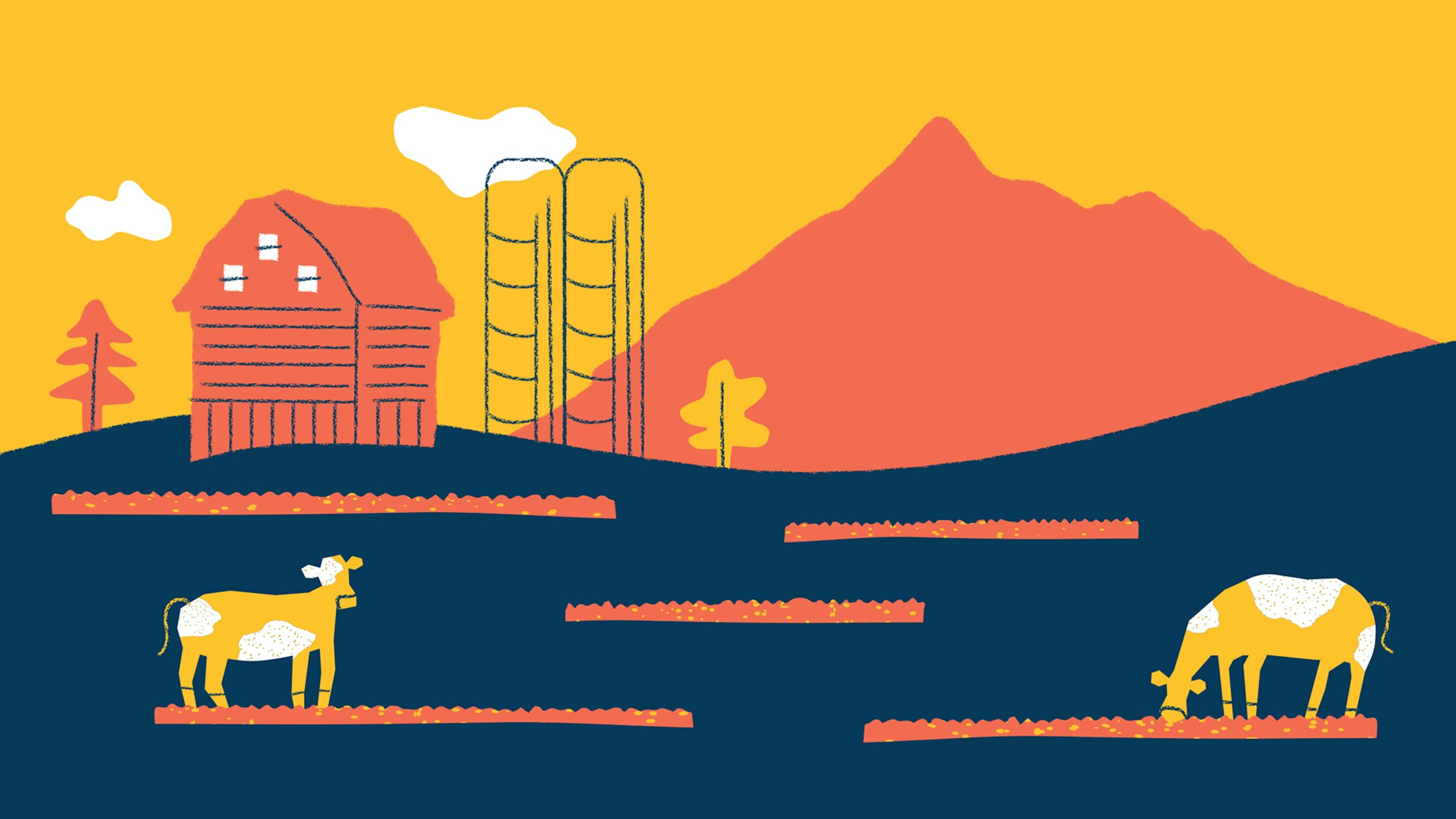
We developed an illustration style to add an organic softness to the brand. Our goal was to guide consumers through each panel of the carton, telling the brand story, teaching about carbon emissions, and sharing about Neutral's approach to offset their own footprint through strategic partnerships.
The brand elements come together on the carton packaging to create a dynamic and engaging brand story. Staying true to our goal of transparency, we highlighted the exact carbon cost — and offset value — of each carton of milk, and placed this information prominently on the front of each carton.
A few months later, after the initial launch of the half-gallon cartons being sold locally in Portland’s New Seasons Markets, the brand was proven successful and Neutral was ready to grow its product offering.
We dove back into the work and expanded the packaging system to apply to gallon and pint sizes, added to the illustration library, developed signage to be displayed in local coffee shops and grocery stores, and art directed a photo shoot.
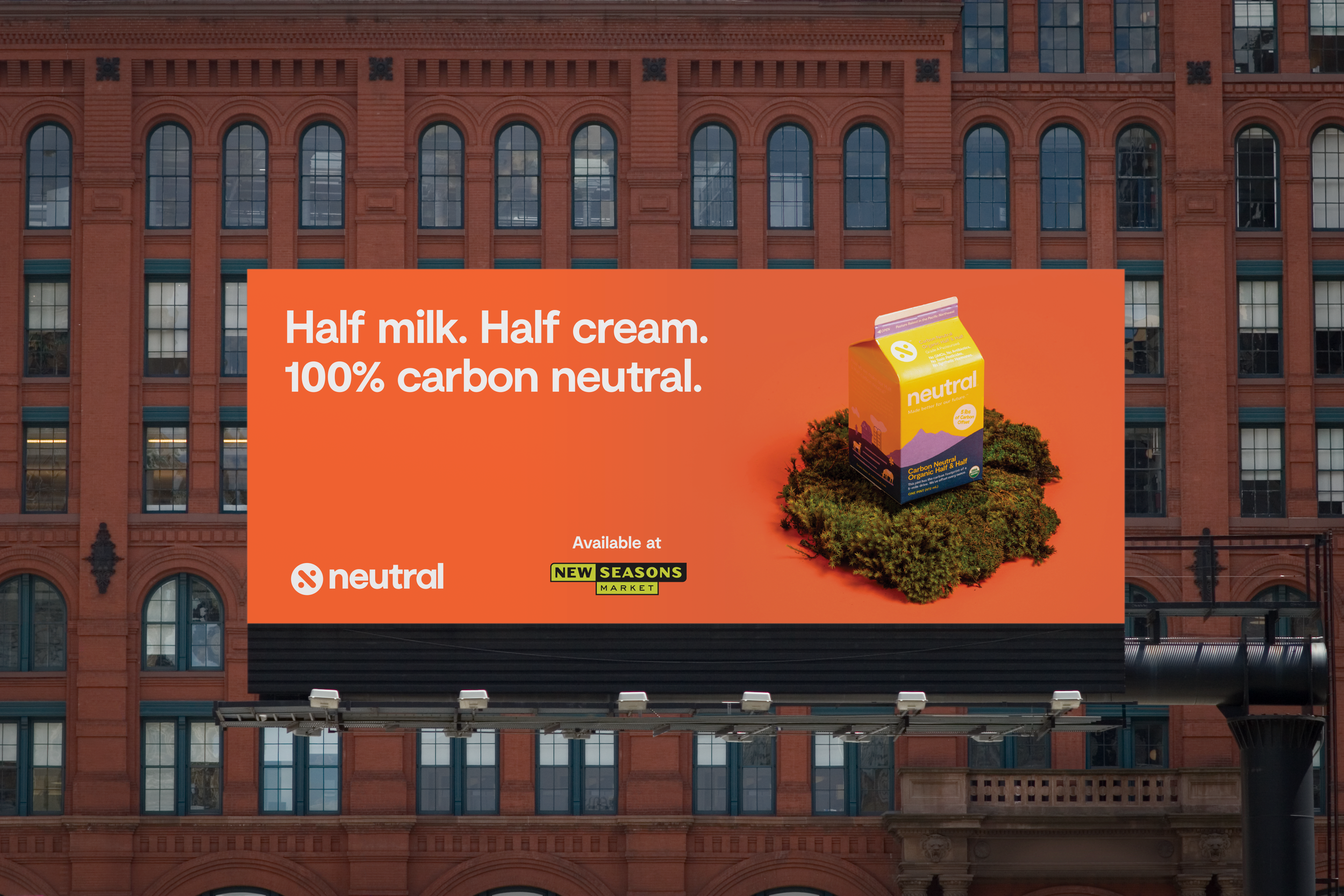
We created a marketing campaign announcing the launch of Neutral’s pint-sized Half & Half to spread awareness and build momentum around the brand and its growing product range.
The campaign consisted of billboards, digital banners, e-commerce, postcard mailers, and social media ads.
In addition to the campaign materials, we developed a fact sheet that would be used to pitch the brand to stakeholders and potential grocery store stockists. The brand and campaign achieved significant results with the products being distributed nation-wide in Whole Foods.


